Style Guide
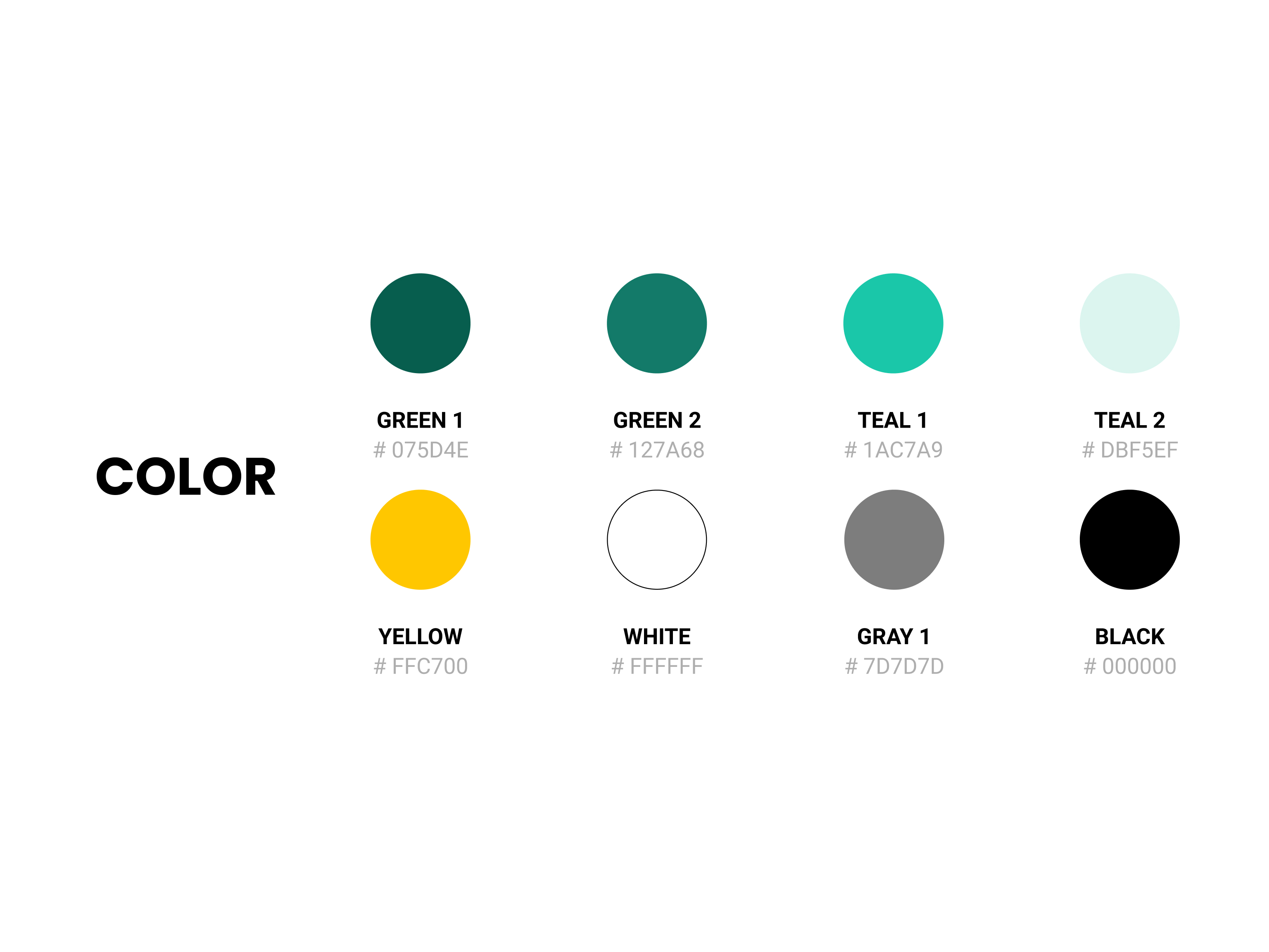
Before beginning the actual design, I needed to set up an overarching style guide. It was longer journey then I thought. Starting with colors, I learned that Accessibility is the key. I used WebAIM to ensure color variations have enough contrast from each other. (Not with the color next to each other but with every other color in the list with exception of Yellow which has WCAG Pass for AA with Green 1.)
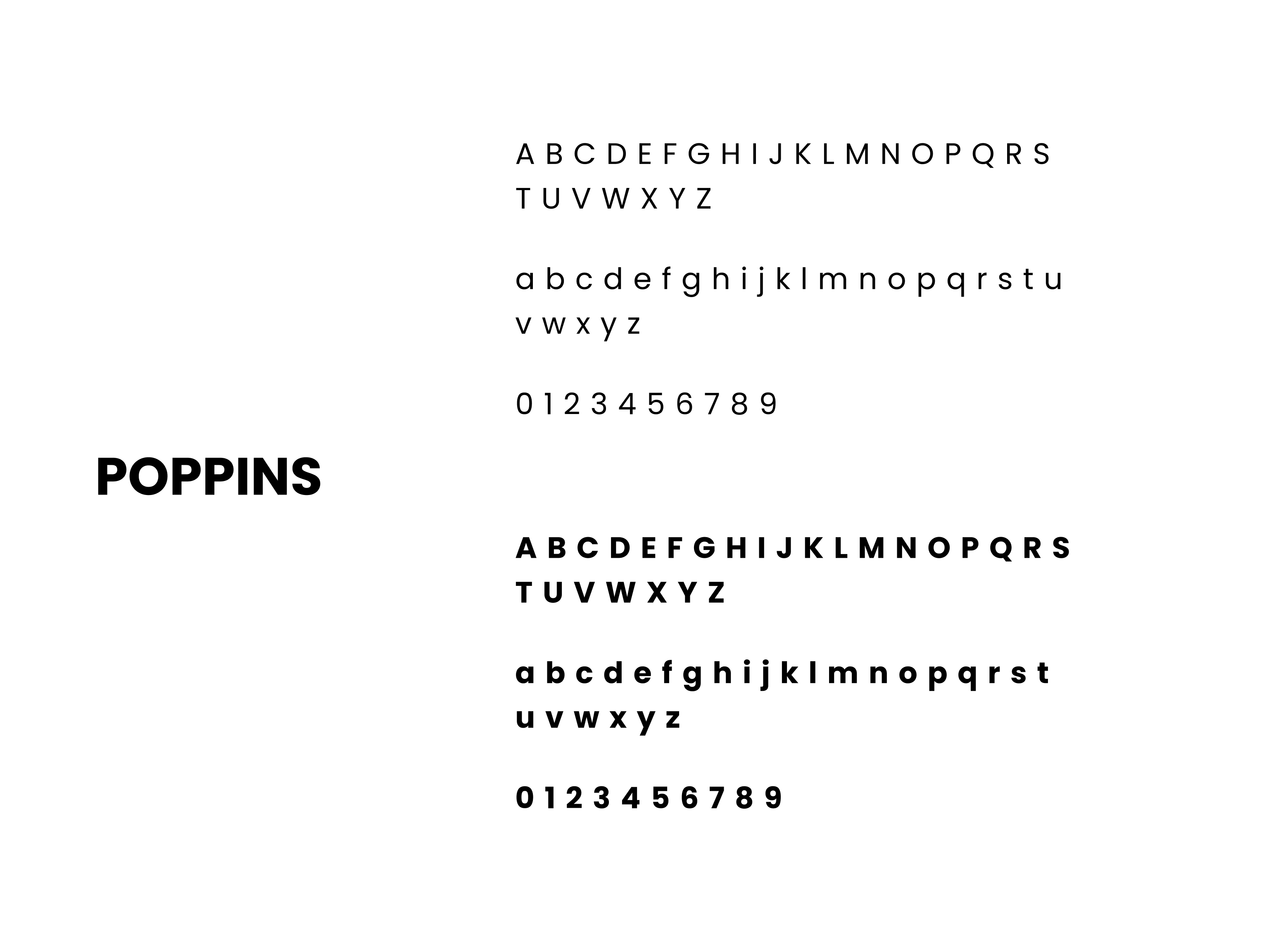
Learning about Accessibility, I finally solved my long question of why the branding colors were changing last couple years for companies like Robinhood and CreditKarma. For Typefaces, I was venturing different set of fonts but arrived to the conclusion that Poppins embodies AskMonie's friendliness and modern aesthetics.
